Curating my Corner of the Internet with a freehand web editor
TLDR; I've been using an abandonware WYSIWYG web editor called Hotglue to make frivolous, truly drag-and-drop websites with no regard for users other than myself. It has been a lot of fun.
2024-06-20
Thirty years after it began, the Internet feels like it has lost most of its magic. We as a society appear to have decided that constant novelty is the only thing we'll agree to suffer through ads for. Correspondingly, our collective web experience frustrates more than it excites. It is a whiplash feed of ephemeral 'content' interspersed with ads and walled within 3 or 4 platforms with web-accessible front-ends (social media, newsletters, Discord channels). They'd all love for you to switch to the mobile app, though.
Websites still exist, but they too have consolidated themselves into blog-based periodicals at the mercy of search algorithms and have cheapened themselves with affiliate link-stuffed "best [product category] for 2024" articles among a deluge of low-information posts which are helpfully obscured by an email signup modal. It is entirely devoid of much of the personality that made the early Internet so weird and wonderful.
Why did this come to be? It is because the only people making websites anymore are those that look to monetize it in some way. Personal websites are becoming a historical artifact rather than being part and parcel of the web itself.
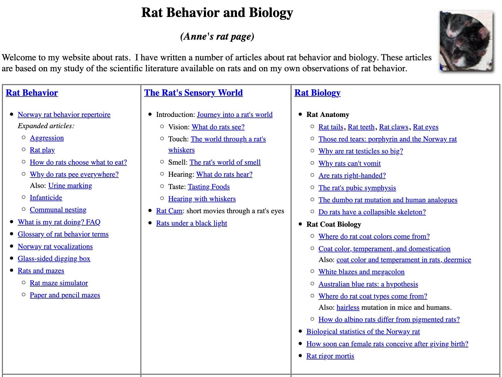
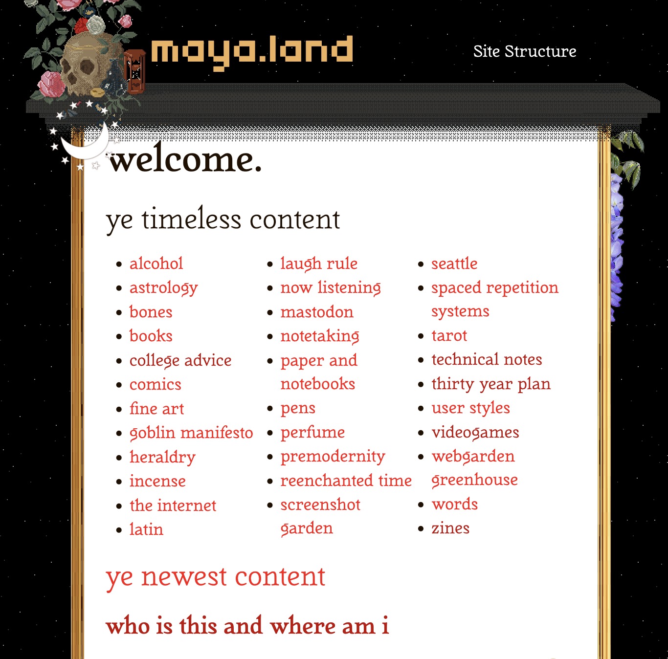
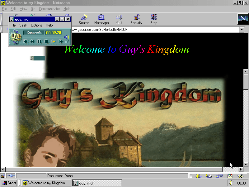
Such websites used to be made for no other reason than a person wanting to keep an online record of things that were meaningful to them, or what they were cultivating knowledge about. These are the types of sites I'm talking about:
There are lots of reasons why sites like these don't exist anymore; I won't rehash them here. My focus is on one of the biggest culprits that does not receive enough attention:
Too much knowledge of code is required to create a hand-made website. Building one shouldn't be any more difficult than making a PowerPoint.
Website v Blog
A blog is something that the centralized, templated worlds of social media, Medium.com and Substack have mostly absorbed. Those who continue to host one on their own domain like this site tend to treat it as a "hire me!" billboard or fill it with boring think pieces. If this site weren't proof enough, have a gander at what comes up when you browse the Kagi Small Web or the Bearblog.dev index.
A website should be different. It should be an online outpost of authentic pages created by people, not businesses, marketers or side-hustlers. There is about as much "content strategy" on a website as there is for making a scrapbook.
Websites of yore, the ones that come up on a Wiby.me/surprise visit don't have a content management system (CMS) under the hood, and are thus unshackled by templates, the tyranny of the chronological blog format, and the rat race of attempting to rank on Google.
These types of personal websites are mostly snapshots in time. They're not meant to be updated daily, and thus will fall out of favour with search engines. Deploying these websites is no more complicated than copying a folder of HTML files and corresponding assets (images, stylesheets, etc.) on to a web server.
We desperately need these types of sites to make a comeback to combat the stifling sameness of being online today. We can't expect to turn back the clock and have everyone writing HTML by hand again, not when we're all accustomed to typing text and uploading media via carefully manicured, intentionally minimal user interfaces.
We need a freehand web editor that allows us to express ourselves outside of these bounds.
Defining the "Freehand" Web
Quite simply, a freehand web builder offers the following features:
- Place items anywhere on the page without writing any markup. Markup, styles and scripting are supported, but are not the primary method of getting media on the page.
- No templated "safe zone". Any part of the browser viewport is fair game for placing elements and media. If there's space to spare on your screen, you should be able to put something there.
- The ability to Drag and Drop images, text, audio and video straight on to the page, without writing anchor links.
- Immediately publish to the open web (preferably on your own server).
There used to be professional tools that offered a certain level of WYSIWYG (What You See is What You Get) design in the past:
- Microsoft FrontPage
- Adobe PageMill
- Macromedia (later Adobe) Flash
They weren't perfect by any means; they were pricey and targeted at businesses over consumers. By 2010, they had all fallen by the wayside, replaced by code-heavy tools better equipped to manage the growing complexity of commercial web development.
FrontPage allowed WYSIWYG design, but the editor was janky and felt like coralling a Microsoft Word document into a website. Websites built by university instructors from that era often had that telltale look of something that was built in a Word-like editor and exported to HTML. Flash was primarily an animation design tool, and while it was suitable for freehand web design, it had a steep learning curve due to its focus on scripting and interactivity.
Modern tools such as Squarespace, WIX and Webflow offer WYSIWYG as well, however they too are targeted at businesses, not hobbyists, and thus have a user experience that's still very much focused on the creation of commercial websites -- product sales pages and e-commerce sites.
Common Objections
Now those who are familiar with web design are probably revving up to comment on why this approach won't work. Let me get the biggest objection out of the way:
#1: Squarespace/WordPress aren't freehand page builders, because they have to account for mobile-friendliness, adapt to multiple screen sizes, prevent unintended mistakes from users, optimize for search engines etc.
That is valid. But it's not relevant to what I'm saying, which is that we could still use a PowerPoint-level web maker. Having Adobe Premiere Pro in 2004 didn't mean that Windows Movie Maker wasn't underpinning a lot of the content library of early Youtube.
Did it look cheap? Maybe, if you stuck with the default settings. You didn't have to, but defaults are powerful. It's why everyone posted on Medium.com a decade ago after all; it's design decisions gave it a more attractive look out of the box than Blogspot or Typepad. And then once those defaults became commoditized across all apps with a text box, we went back to wondering "Why do websites look so boring?"
#2: WYSIWYG design is a bad idea and generates spaghetti code that is hard to edit outside the authoring app
These days, I'd say that argument needs to be laid to rest. In the web development world, people aren't editing .html files directly anymore, they are using an authoring app (e.g. Visual Studio Code) to edit the markup, and using some sort of pipeline to manage code revisions, and deploy to a web server. If your tech stack is a CMS, then there usually aren't .html files at all. User inputs (posts) are stored in a database, and a page is generated dynamically server-side.
Moreover, not having to worry about things like grid, flexbox and float allows the average person to use the web as a pure canvas, infinite paper. It's what whiteboard software does so well.
But unfortunately whiteboards aren't the 'web', they don't feel like websites. They're usually login-walled, and pay-walled, and take a long time to load to pull in all the background Javascript. Most of all though, they're designed for 'collaborative teams' and not weirdos who want to fill up the entire viewport with cool media.

Y'know what else can do shared pages? A website!
Exploring "Hotglue"
Hotglue is a fascinating open-source "anything goes, WYSIWYG" website making tool. I'm using a self-hosted version that's available on their Github. They also have a hosted version that's been used in many art school classes, so there's a healthy library of one-off project websites on it. It is a PHP package, so deployment is pretty simple: just drag and drop the folder into a web server running PHP; it does not require configuring a database like WordPress does.
As it is open-source and has not been updated for a while, it didn't run initially on a server running PHP v8. A minor tweak was needed to make it work, which I've documented in this Github issue.
It has plenty of caveats, and you wouldn't want to use it for anything that could be seen by a client. But it is fast, very visual and fun to use, and surprisingly extensible considering that active development appears to have stopped nearly a decade ago.
Here are some sites I found interesting:
MollySoda's Desktop Dump Archive appears to be a visual scrapbook-style site, collecting pieces of Internet ephemera, one for each month that the user was using Hotglue. I could see myself using it for something similar, keeping a web log of the infographics, images and memes I save to my phone, which often ends up crowding out the regular pictures in my photos app.
Note that the freeform arrangement of images and text make the site look much denser and more lived-in than what a similar CMS-templated page would offer. On a Wordpress/Squarespace site, this arangement would resemble an Etsy page displaying a soulless grid of products.
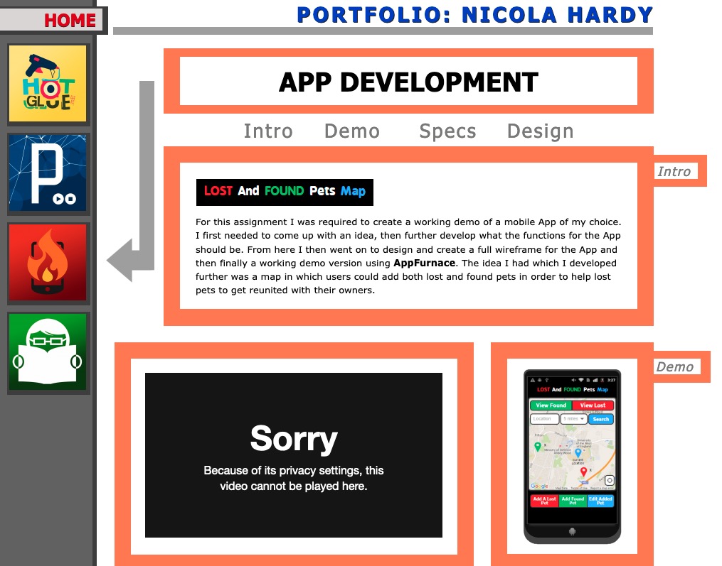
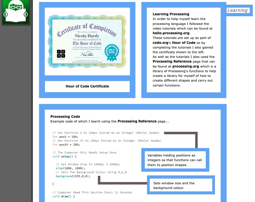
Nicola Hardy's Portfolio site takes a more buttoned-down approach to site design, while still displaying a lot of personality with colours and shapes. There is a clear visual identity, plenty of padding between elements to delineate separate content areas. This is what templates attempt to do, and it's a good example of how a freeform web builder allows you to (mostly) have the best of both worlds: structure and freeform chaos!
Right away, you can see the potential for building template-agnostic layouts for information however you like.
MollySoda's website
Nicola Hardy's website
Hotglue User Interface
Right off the bat, the Hotglue UI feels significantly different from other web authoring tools you might have used before.
There is no visible navigation bar at the top of the screen like many other WYSIWYG tools. When you create a new page, you start with a completely blank canvas. Clicking once brings up a menu, and double-clicking brings up a more detailed menu. The crudeness of the UI and the limited (but not drastically so) formatting palette gives pages its own form and personality, and prioritizes fast creation.
Being able to drag the mouse up to adjust fonts and Colors, and drag and drop images into the browser window and have them immediately show up makes things visual at a level that feels fundamentally different from editing a site in WordPress or Squarespace where there is a clear distinction between "editing mode" and "viewing mode".
In Hotglue, there is amost no distinction, except for the URL bar that has an "/edit" bit at the end. Changes you make on the canvas are immediately saved to the state of the page. There is no "Publish" button to hit, it is immediately live on the website.
If you're concerned about elements being mis-aligned, there's a handy "grid" overlay that helps you visually align things.
Menus
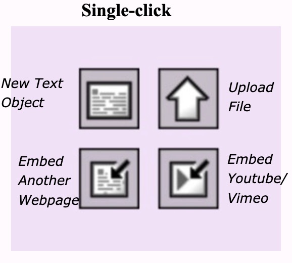
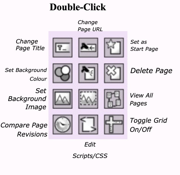
Alignment Grid
Click and Drag adjustment of element dimensions
Building my own mini-sites
I created a few pages and linked them all together on a corny "homepage".
The main page I made is a review of Hotglue's HTML/CSS/JS customization capabilities.
Another page I made is a list of electronics I've sold after getting my maximum use out of them, designed in the style of an electronics store flyer. I used to keep a spreadsheet of this on Google Sheets, but mapping them out this way was a lot more fun!
It's very easy to put together mazy layouts; everything is genuinely drag and drop. Compare the ease of aligning blocks of content compared to a rigid system of real HTML/CSS that immediately saps your will to live. No grid-template-areas or z-index: 9999 or colspan/rowspan nonsense here.
Changes made are immediately saved to the page. This offers a sense of immediacy that you'd get with a regular consumer app like Pinterest, but is unique for an OSS project where usually there is an 'editor' mode that looks and feels different than a browser environment, and usually requires you to explicitly hit a "Publish" or "Submit" button for your changes to be saved.
I've used tools like Obsidian and Logseq's whiteboards, as well as numerous mindmapping tools, and yet I keep coming back to Hotglue for two main reasons:
- It's genuinely faster to load than the aforementioned dedicated apps, which include a lot of background Javascript, as they are built on Electron.
- Everything is online immediately, so I don't have to think about publishing changes. I can immediately pull them up on my phone or another device without worrying about device syncing.
Who is the freehand web for?
Anybody who thinks better on pen and paper than a Word doc.
Anybody who wants to produce, collate, and publish information without monetization, in a format/platform that isn't bent to the needs of the aspiring monetizers.
Anybody that recognizes the potential of HTML/CSS/JS as an interactive, freeform and endlessly malleable document format. A document that isn't artificially constrained by templates, but can be tamed with HTML directly if needed. A document where content doesn't have to flow from left to right (or RTL) or top to bottom. It can be a digital scrapbook if need be.
If you've appreciated the width of a OneNote page or Excel document, you can understand that not all information should be mandated to be displayed in a top-down fashion.
Hypertext pioneer Ted Nelson struggled to get his 1974 book Computer Lib/Dream Machine published because it had an unconventional size and format that caused most publishers to reject it. Eventually, he would spend $2,000 ($12,000 in today's money!) out of his own pocket for a publication run of a few hundred copies, each in a giant 10.7" x 14" format, larger than most magazines.
The web we have today incorporates many of the concepts he discussed decades ago. The cost of self-publishing our ideas online is a mere fraction of what it was back then. Best of all, we aren't restricted by the desires of the publisher. Back then, it might have been Penguin or Random House. Today, it's social media networks and blog engines.
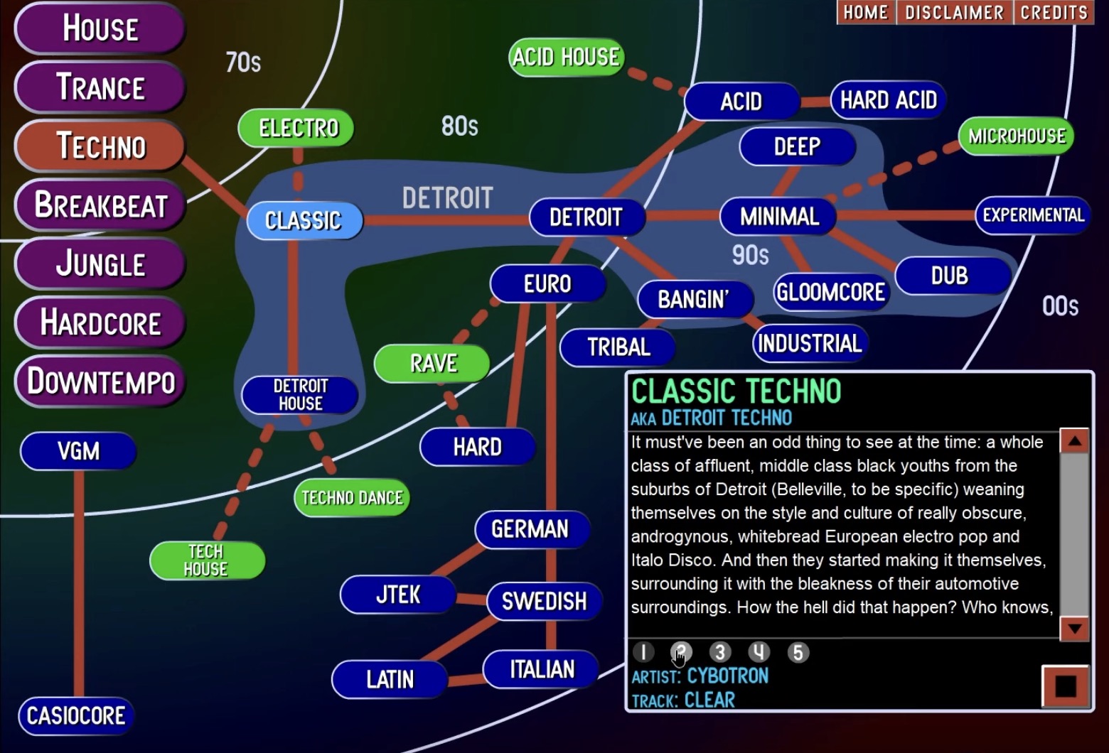
The website examples I showed earlier were are all 15+ years old. But even apart from the shrines to GIF maximalism, there is relevant content today that would be robbed of its personality if it had to be squeezed into the ever-narrowing viewports of smartphones.
Ishkur's Guide to Electronic Music, original Flash version, c. 2002
A familiar UX for the freehand web
There are applications that allow for the freeform visual arrangement of text, images and shapes, so the UX of what a freeform website builder could look like is already well established:
- PowerPoint/Keynote - as easy as it gets. The point-and-click, drag-and-drop user interface has been around since 1987 via Hypercard, its spiritual predecessor. Hypercard even included a full scripting language under the hood that allowed people to write their own applications on the back end, and 'draw' the user interface on the front end. While PowerPoint and its ilk were never given this capability, web authoring tools like Macromedia Flash (later Adobe Flash) were able to achieve this level of dynamic interactivity for the web, before they fell out of favour in the early 2010s.
- Excalidraw/TLDraw - lo-fi wireframing and sketchnoting. The hand-drawn feel of these make it more approachable to use compared to a full on prototyping or system diagramming tool. Excalidraw especially has become very popular for building very information-dense documents.
- Sketch/Figma - used for web prototyping
- Mural/Miro whiteboards for collaborative brainstorming.
But these are all login-walled, paywalled or app-gated. They're mostly designed for companies, not individuals. While people do end up using them for personal use, they still can't simply build an HTML file that can be placed anywhere and shared with anyone, without any restrictions. We should be able to make websites with the exact same ease of use as the above tools.
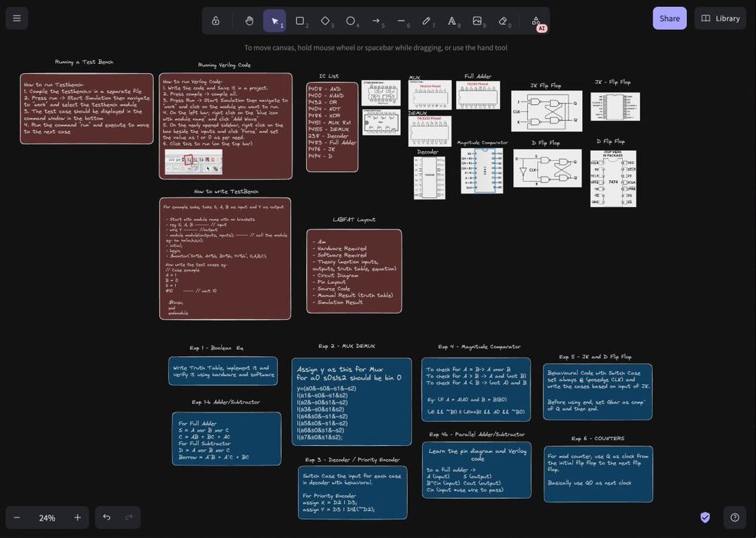
Excalidraw in action Image Source
Principles for Designing a Wilder Web
- Your first page will be ugly; there's no getting around it. Faced with the spectre of the blank page, you will make something that is messy and amateurish. Some will look at the end product and hate it. It won't look like how a website should. Some will want some structure, some sanitized inputs. Those people should choose a blog. Freehand web design is about fewer constraints, not more.
- Remember that "Personal home pages" were always ugly. The world of "professional web design" didn't kick off until '99 or so, when businesses started to come online, and required a more buttoned-down look and feel. As early as 1996, Tim-Berners Lee, one of the main inventors of the WWW commented that homepages were gauche and frivolous, likening them to a garden gnome on someone's lawn, rather than the house itself. We've been living in the world of massive whitespace, remotely downloaded fonts and 'clean design' for decades, so some level of unlearning will be necessary to create and embrace your own proudly garish attempts at information design.
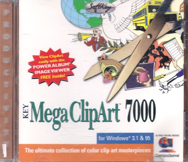
- Pollinate your website with clipart. This can come in any form: hand-drawn sketches from your pen-enabled phone/tablet, PNG exports from Excalidraw, desktop icons from Windows 3.1 or CDs of clip art preserved in amber on the Internet Archive.
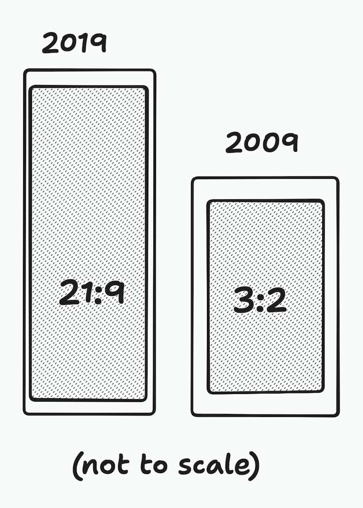
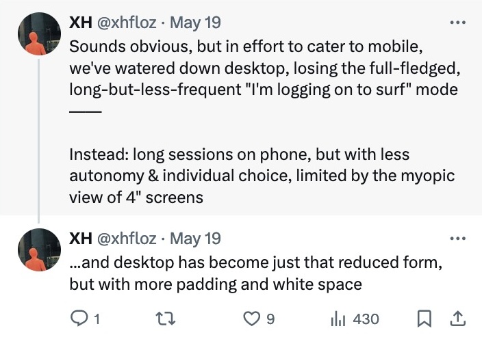
- Don't be afraid to go wide. After years of social media overload, we've been been subliminally trained to believe that thoughts and concepts should be mapped out in no more than 280 characters (Twitter), or a one-minute video shot in 9:16 aspect ratio (TikTok), or an image in a 5:4 aspect ratio (Instagram). That isn't how information is gathered and arranged in real life, but it is a way in which information can be interspersed with advertisements. Your website is a not a billboard - your incentives are not the same as that of an ads company.
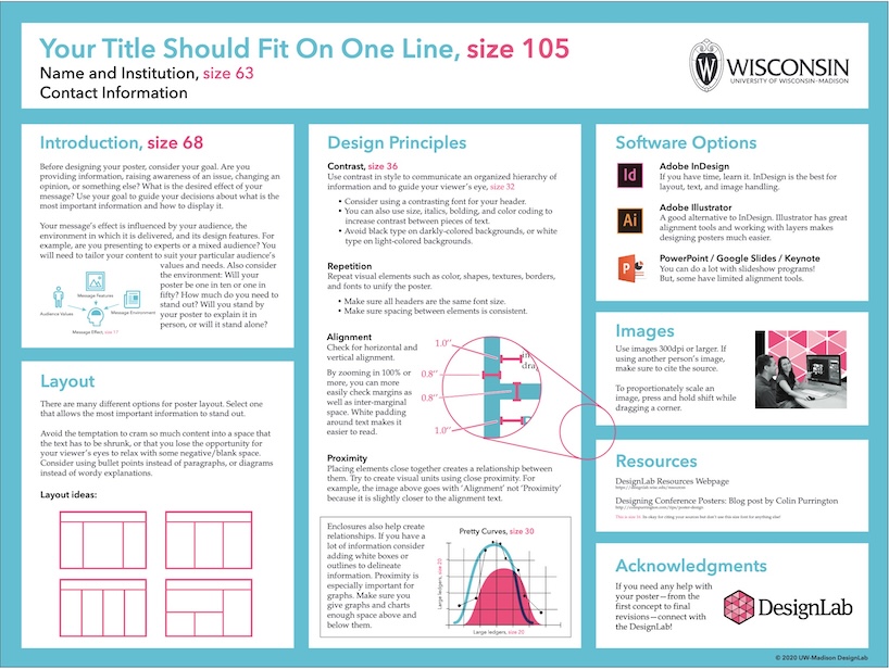
- Build your own navigational language. Apply principles from sketchnoting, such as having a consistent set of icons and symbols to denote where somebody is on the page. Take inspiration from the world of academic research posters, whose design guidelines emphasize the scannability of information-dense layouts.
analyte123 on March 5, 2021
Doing crazy things with CSS, including animations, has never been easier or more consistent between browsers, and yet creativity in web design has gone down practically to zero these days. I blame mobile, where nobody can seem to escape from the "responsive column of blandly styled content" paradigm.
Source: HN
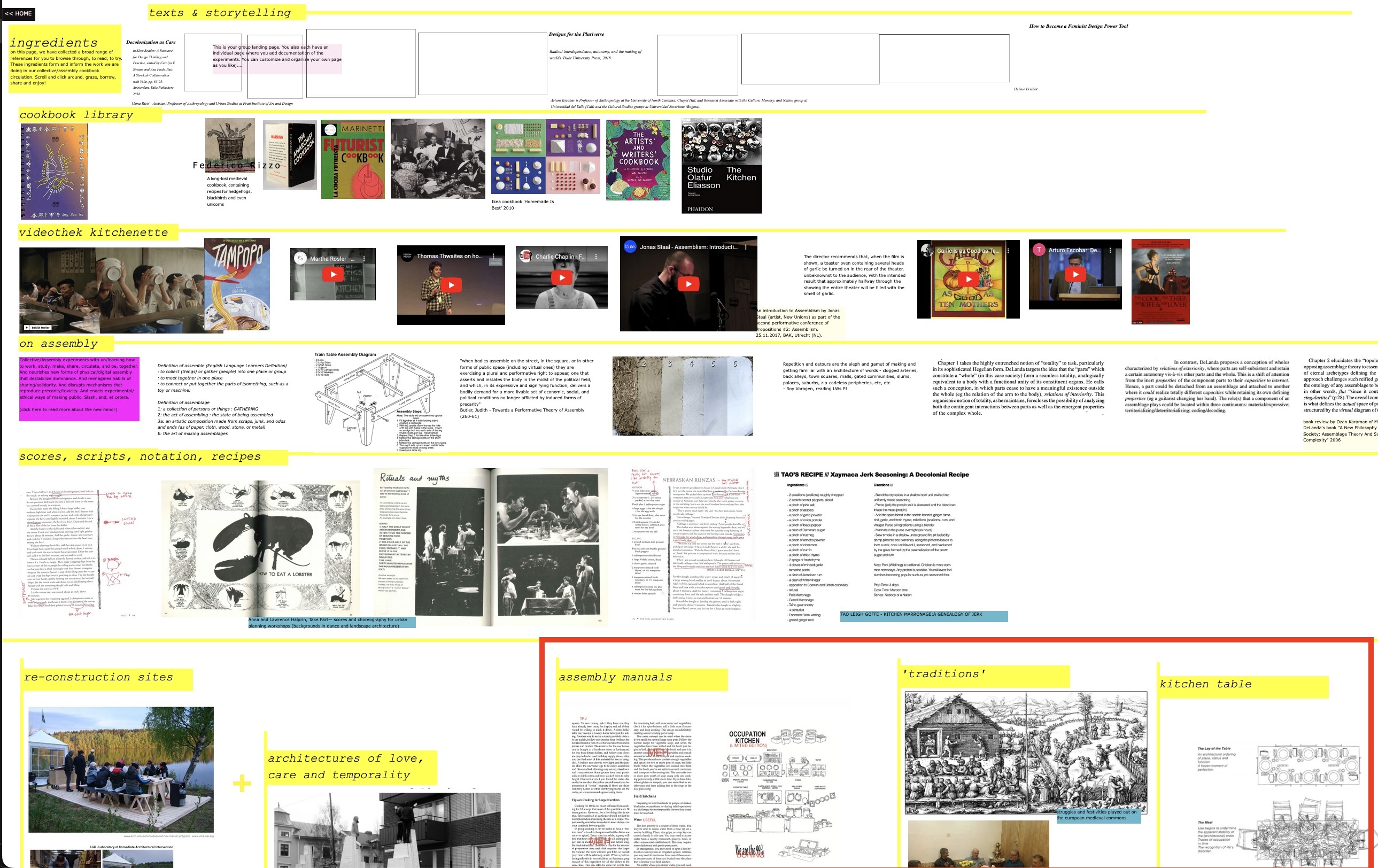
Example site at regular 100% browser zoom
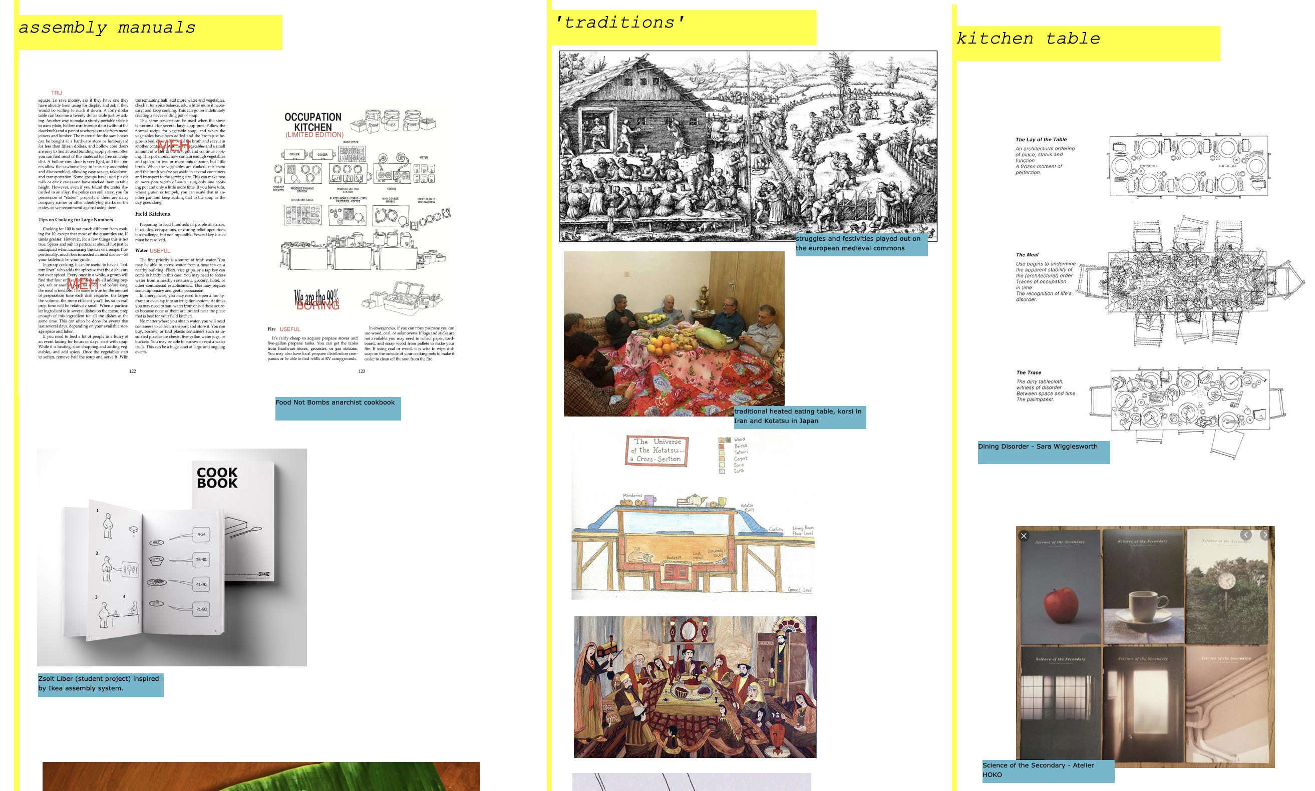
30% browser zoom; area in the first image delineated by the red rectangle
What's Missing?
Hotglue is a proof-of-concept tool. While very usable, it has significant limitations if you are looking to build something that you expect a lot of viewers for.
- It's not responsive out of the gate, which goes without saying for something that allows absolute positioning of elements. It doesn't reflow in WYSIWYG mode, just as a PowerPoint won't. However, as it is a website, you can write HTML/CSS directly and build a responsive page if you want.
- Navigation requires a mouse. On mobile, you can sometimes bring up the operation menus with a tap-and-hold on the screen, but it's not reliable. If you have a mouse connected via USB OTG, or better yet, a lapdock, you'll be fine. There are also no keyboard shortcuts.
- Password-protection for published pages is lacking. While editing pages requires a login, the pages you create are immediately published, with no way to "unpublish" them without deleting the page entirely.
- Audio and Video cannot be added via drag-and-drop, you have to write the appropriate HTML and specify the location of the files in your anchor links.
- There is no alt text for images, which is a surprisingly big oversight
- Hotglue needs a live PHP web server with HTTPS; it won't run on a localhost server.
These are all issues a future successor should account for.
SEO and Website Discovery
Optimizing your website for the benefit of the one search engine has been a big reason for why the Internet is so bland today. SEO for this kind of freehand website doesn't make sense, not least because engines don't even bother linking to sites anymore, if they can simply fish out an 'answer' (even when you didn't ask a question). In the world of freehand websites, you're better off working within the decentralized underground of webrings and Fediverse posts to have your pages seen.
Here are some webrings to get started:
johnnyApplePRNG on Jan 30, 2022
I feel like google adsense or monetization in general was the downfall of all of that early web richness. When the web was first created, everybody got on and just started learning html and making things... because humans are creative. I did the same. I made fun websites with/for my friends. I loved geocities.
Then after a few years, I was only concerned with pumping out crap content and how many pageviews I was getting.
Source: HN
Modern Alternatives
Hotglue isn't the only game in town. Thankfully, there are a handful of (commercial) tools that take a more playful approach towards building websites.
- Tumult Hype: this is a MacOS application that is the closest alternative to Adobe Flash. It meets all the criteria of the freehand web described earlier in this article. Most importantly, it generates an HTML file and folder with all resources (images, media), which can be run completely offline, through a USB stick for example. Using Hype, I was able to extend what I was building in Hotglue with a much-needed feature improvement: adding pan-and-zoom via this amazing Github library: Anvaka/Panzoom . It's also available as a one-time payment app, an increasing rarity in the software world.
- MMM.page: This is a subscription-based web app that is closest to the spirit of Hotglue. The creator writes often about the loss of the wilder web, which is always a good sign.
- Kinopio: A subscription-based web app that focuses on building mind maps rather than pure websites, but the philosophy is very similar: a desktop-first, infinite canvas approach to information design.
But do people even want to make websites anymore?
That depends on what preconceptions you have about what a website should be. If a website to you is a blog that you'll feel obligated to keep updating, you won't want to make one. But if a website is a simple document you can create once, and aren't really worried about views or freshness, then perhaps that is more manageable. Like a sketchbook for your thoughts, referenced frequently, but updated only periodically.
The internet is changing, from an open savannah of boundless information, to a dark forest where non-HTTPS sites are hidden, and answers are instantly provided via an opaque chatbot fed on data from millions of SEO-optimized, advertisement and affilliate-link ridden blogspam sites.
As a result, we're no longer surfing the web, but rather curating the parts we like best, either by taking screenshots (which will never leave our gallery app), creating Youtube playlists, posting links on Hacker News and bookmarking things on Twitter. We're already building a web of information that's mostly for our own reference, but needlessly siloing it among many different platforms that are financially incentivized towards catering to advertisers, not users.
While there are SaaS tools that do this (Are.na, Milanote and Pinterest come to mind), they too require you to pigeonhole your thoughts into their predefined boxes, when all that's really needed is a browser and your personal website.
The freehand web allows for the construction of simple sites that aren't designed for infinite scrolling, but rather as gardens and fields to be explored.
This isn't for everyone: some, nay many, will prefer an Internet that is mostly a content dumb pipe. The RSS zealots, the reader mode obsessives, the minimalists kneeling at the pedestal of motherfuckingwebsite.com - they will hate freehand websites.
For everybody else that wants to explore a lived-in, thoroughly personal, annotated web experience, there is (mostly) Hotglue. But there should be much more.
